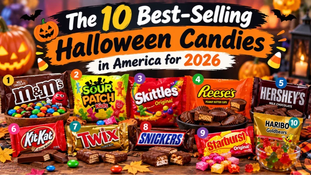
The 10 Best-Selling Halloween Candies in America for 2026
M&M's tops one 2026 candy ranking and Reese's tops another—here's what each number actually measures and which one should guide your cart.
Which candy should actually go in your shopping cart this year — the one crowned “best-selling” by a projection, or the one that shows up most often in real receipts?
- CandyStore.com’s 2026 list is built from projected pounds sold, largely weighted toward a handful of high-population states, not a nationwide sales count.
- Instacart’s data reflects actual completed transactions on its platform, which is a real-world number but only covers one slice of how Americans buy candy.
- A candy can “win” because of a small, vocal advantage in one or two big states, even if it ranks modestly almost everywhere else.
- The gap between M&M’s and Reese’s at #1 says less about which candy America loves more and more about what each dataset was built to measure.
What “best-selling” actually means here
When a headline says a candy is the “best-selling” of 2026, it sounds like someone counted every bag sold in America. That is not what either number represents. CandyStore.com’s ranking is a projection — an estimate of pounds likely to sell, built from historical patterns and weighted heavily by a small group of large states. If a candy performs unusually well in a couple of high-population markets, it can pull the national projection upward even if its performance everywhere else is average. That is a very different exercise from counting actual units sold at checkout.
Instacart’s number is closer to a real transaction count, but it is scoped to one channel: orders placed through its delivery and pickup platform. That means it captures a real pattern of behavior, just not the full market. Warehouse clubs, drugstores, dollar stores, and in-person grocery trips where a shopper grabs candy on impulse are largely invisible to it. Both numbers are legitimate in their own lane. Neither one is a full census of American candy purchases, and treating either as “the” answer is where the confusion starts.
Why the rankings contradict each other
The simplest explanation is that a projection built on a handful of states and a transaction log built from one retail channel are measuring overlapping but different things. Picture two different surveys of the same country: one samples opinions heavily from a few large cities, the other samples only people who shop online. They can produce two defensible but different “winners” without either being wrong.
Add in a separate best/worst preference survey — the kind that asks people to name favorite and least-favorite candies — and you get a third signal entirely, measuring opinion rather than purchases. That is how candy corn can rank respectably by volume sold while still getting tagged as the most disliked candy in the country. Volume measures what people buy, often out of habit or availability. A preference survey measures what people say they actually like. Those two things are related but not identical, the same way a bestselling cereal is not automatically anyone’s favorite breakfast.
There is also a scale problem. A candy can top a projection by excelling in one or two outsized states, then land in the middle of the pack almost everywhere else. A projection that rewards state-level dominance will produce a different #1 than a transaction log that rewards consistent popularity spread across many smaller orders. Neither method is dishonest. They are simply answering different questions and then both getting compressed into the same simple word: “best-selling.”
The cocoa-price story deserves a skeptical read
Part of this year’s narrative is that rising cocoa prices are pushing buyers toward fruity and sour candy and away from chocolate. That is a plausible story, and chocolate makers have been dealing with higher cocoa costs for a while. But a plausible story is not the same as a documented trend. Nothing available here ties that shift to independent commodity-price data or to verified retail pricing across a representative set of stores. It may be accurate. It may also be a narrative built to explain a ranking after the fact. Readers should treat it as an interesting hypothesis rather than a proven cause until it is backed by pricing data from outside the company making the claim.
What the size of these rankings actually represents
“Best-selling” implies enormous scale, and Halloween candy spending nationally is genuinely large. But the specific brand rankings sit inside that bigger number, not on top of it. A projection of pounds sold across a few states is a meaningful but partial slice of total candy movement nationwide. A platform’s transaction count is a real but bounded sample of one shopping channel. Neither ranking tells you what share of all Halloween candy in America actually carries that brand’s name. Readers often assume “#1 best-seller” means something close to a majority of the market. In reality it usually means “the highest number among a limited, specific dataset,” which is a much smaller and more modest claim.
Why age groups might explain the gap
One underexamined piece of this puzzle is who is doing the buying. Instacart orders are frequently placed by adults stocking up for trick-or-treaters, office bowls, or parties, often buying what they personally enjoy or what travels well in bulk. Projections aggregated at the state level capture a broader mix, including households buying specifically because kids requested it. Peanut butter cups and chocolate-based candies tend to perform well with adult buyers making deliberate choices, while sour and fruity candy often wins with kids making direct requests. If adult purchasing behavior is overrepresented in one dataset and child preference is better reflected in the other, that alone could explain why the same season produces two different #1 candies without either number being wrong.
| Data source | What it actually measures | Best use for shoppers |
|---|---|---|
| CandyStore.com projection | Estimated pounds sold, weighted by a few large states | General sense of broad national trends |
| Instacart transactions | Actual completed purchases on one platform | What similar online shoppers are buying right now |
| Preference survey | Stated favorites and least-favorites | What people enjoy, not what they buy most |
What to do with this before you shop
If you order groceries online and want a practical signal, the transaction-based number is the more honest guide to what similar shoppers are actually choosing. If you want a sense of broad, old-fashioned candy-bowl staples across the country, the projection is reasonable as a general trend indicator, not a precise count. If you are deciding what you personally like best, ignore both and lean on the preference data instead, since it is the only one of the three actually designed to measure that.
The most useful move is to stop asking “which candy is #1” and start asking “#1 by which measure, for which kind of buyer.” Once you know that, the contradiction stops being confusing and starts being useful.
Which number would actually change what you buy this Halloween — the projection, the purchase data, or the preference survey?

James Carter
The EverBBQ editorial desk — covering BBQ news, features and everything off the grill.